
Deconstruct

1. Let's Meet up
First off, we schedule a meet up. A viable opportunity to get to know each other. Following these necessary early meetings and research, we can establish communication protocols, your milestones and timelines, our deliverables and scope, your roles and expectations.

2. Project Analysis
After receiving your order, we carefully analyze it. In case we have questions, we will contact you with our suggestions and come up with the best solution. This analysis guides us in tailoring a solution that is effective and sustainable.
Time will be spent getting to really understand your brand by analyzing past and present marketing materials,reflecting on future marketing strategies in connection with your web project.
After everything is clarified, we confirm the time-line and the project budget in case extra features apply.

3. Strategy & Direction
We'll create a site map for your web project so that you get an idea of where everything belongs. From here we will be in a better position to establish the features your users will require and how we can communicate them using well-thought out, well-structured content ith both interactive and visual design methods.
Additionally a project map will be set up and will contain all of the information collated during the Deconstruction phase in a concise documentation outlining your content, technical and creative strategies.
Design

4. UI OR UX Design Mock-Ups
Mock-ups will be created incorporating User Experience Design whether it's web or mobile. Mobile user experience design is evolving. To gauge this, DigitizeThis® can use either Adobe Photoshop or Fireworks to build wireframes and click dummies, helping to express the target users experience.
DigitizeThis® can also use UX Design Tools like UXPin to create prototypes and wireframes for different kinds of devices and resolutions.
5. Responsive Grid Based Approach
DigitizeThis® appreciates the use of grid based designs. This is because it creates a solid visual and structural balance of web-sites. Sophisticated layout structures offer more flexibility and improve the visual experience of visitors. It also enables users to easier follow the consistency of a webpage.
A familiar lightweight 960 grid called Skeleton or preferably Bootstrap is used as a base, because both elegantly scale down to downsized browser windows, tablets, mobile phones (in landscape and portrait).

6. Visual Design & Style Guide Documentation
The wireframe mockups will now have your branding elements, colour palettes and typography to give your site its peculiar look and feel. You'll receive static visual mock-ups at this stage or browser based prototypes.
Next, a style guide wil be created for you which will document the design system used for your site. This will showcase fonts used, typography, button hover and touch states, Media Queries and so on. A style guide actually demonstrates the design concept and branding personality of the design approach.
Develop

7. Theme Design
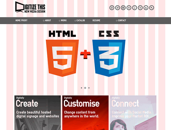
Now the interesting part. Building your HTML 5 based markup with CSS3 using Javascript or jQuery plugins.
Great effort will be made to adhere to best coding practices or standards and attempts to put into practice the latest techniques that allow for a cross-browser compatible code that is easy to read, edit and extend. It will also include a print CSS for readers who choose to print out content.

8. CMS Configuration & Template Implementation
Your website's technical architecture can be built in either Angular, ReactJS using TypeScript or with CMS based tools like Concrete 5® or Wordpress™ depending on your choice ofcourse.
Concrete5® site editing actually happens right on the pages you want to edit. This "In-Context Editing" is very intuitive. See a typo? Fix it right there. Want to add a page? Just go where you want it to show up and click Add Page. In-context editing makes content management a breeze.Concrete5® offers great design aesthetics, flexibility and usability.
WordPress™ on the other hand is a state-of-the-art semantic personal publishing platform with a focus on aesthetics, web standards, and usability.
Both are open source content management systems (CMS) and allow you to change content anywhere in the world.

9. Device / Browser Testing
Today, kids grow up with touchscreen experiences like it’s the most natural thing. Parents are amazed by how fast their children understand how a tablet or smartphone works.
Historically developers approached the desktop side of any project first while leaving the mobile part as a secondary goal that gets accomplished later. The new approach flips this workflow on its head actually beginning with mobile considerations first and then working up to a larger desktop version.
There however might be slight variations due to device specs and usability hence we demonstrate how templates will render in major web browsers and mobile devices like the iPad, iPhone, Android and so on checking for cross-browser compatibility.
The aim is to create a coherent consistent experience across all devices.
Deploy

10. CMS Documentation & Training
Online and PDF documentation will be provided to enable you understand how to use your new CMS and edit your site. The plus to these documents is that both CMSs deployed are easy to use and to implement and offer expanded possibilities.
Access to the support section at the bottom page of this website will enable DigitizeThis® to carry out any bug fixes so as to make sure that your website is ready for launch and even after it is launched.

11. SEO & Site Launch
Your old site will be archived prior to releasing your new website to the general public. Quality checklists will ensure your project requests are all met. Search Engine Optimisation checklists will be made to ensure appropriate search engines track your sites meta tags and keywords almost instantaneously.
Web analytics will be integrated into your chosen CMS so that you can view all these including web analytics and statistical reports from your new websites' dashboard.

12. Job Done
The lifecycle of your website is now complete. Not quite!
Websites are built to evolve constantly. So you'll be in contact with DigitizeThis as often as possible. It's just the nature of te business. One pro is that if you've chosen Concrete5® as your preferred CMS then you can have one website with one CMS and additional design themes at your request as Concrete5® has the ability to switch between design themes.